

Rockwell Kent: Accidental Cartoonist


Rockwell Kent (1882-1971) was not a cartoonist in any typical sense of the genre. He was insanely prolific across all media and seemed oblivious to formal silos that bother art critics and scholars. He worked in book and magazine illustration, painting, greeting cards and postage stamps, bookplates, murals, and, yes, comics (under the playful pseudonym, “William Hogarth, Jr.” for Vanity Fair). He was a working artist who liked to turn a buck, as entrepreneurial as he was genre agnostic. Which is to say that he was an artist in the American grain.
Still, he was best known as a book illustrator, and aside from Dr. Seuss and John Tenniel may be the most famous of all time. But in the simplicity of his style, the thickness of his line, and his instinct for abstraction, all of Kent’s art followed some of the same aesthetic impulses as the comic strip medium that matured with him between the World Wars.
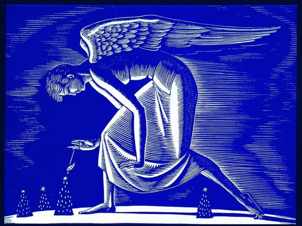
Whether it is the grim determination of Paul Bunyan captured in universal emblems (above: jaw, sleeve, stance) or the goliath angel gently lighting Christmas trees on a greeting card, Kent worked in mythical caricature, but with a very American lilt. He gravitated towards big symbols to evoke broad sentiments. His great contemplations of nature, art and man (Wilderness, 1920 and N by E, 1929) recalled the American Romantics of the previous century (Thoreau, Melville). Like the Transcendentalists, he sought spiritual experience in the objects and experience of nature. The signature Kent her has feet firmly planted, an iron stance, face looking upward. He veered towards great works: illustrating Bunyan’s tales, Chaucer, Shakespeare. And in the American Romantic vein, he generally took an individualist focus. Kent illustrated most great literary works by isolating their heroes in full body solitary images rather than in dialogue.
And I think it is worth arguing that, like the great cartoonists, Rockwell Kent was responding aesthetically to a complex, befuddling age of mechanical precision, materialism and science, with simplicity, abstraction, symbolism. That flat, heavily outlined style hints both of Art Deco and the expressionism of wordless woodcut novels by Belgian innovator Frans Masereel and American Lynd Ward. And you don’t’ need to squint and stand on your head to see likenesses to the contemporaneous folk stylists of the newspapers, Harold Gray and Chester Gould. All of these visual forms – comics, deco, woodcuts, and the Kent style of illustration – were paring down and flattening the world visually into the basics at a time when Americans struggled with a world of obscurity and unmanageable complexity.
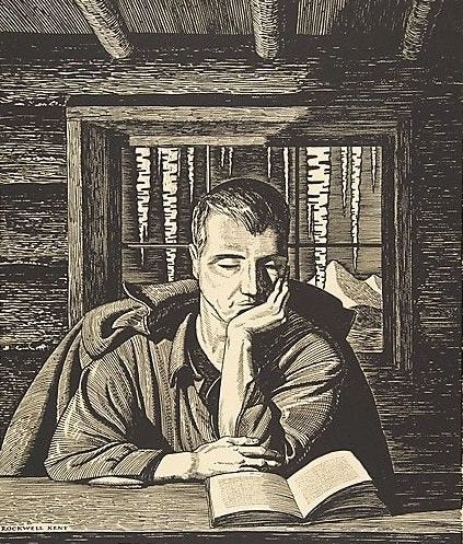
For Kent, the classic relationships of man and nature and through that man and God, were perennial objects of his abstractions. His breakthrough was an illustrated journal of a 1918 retreat to an Alaskan cabin with his art and 9 year old son. His contemplations of nature, man and spiritual searching situated him firmly among American literary romantics. Kent was a seeker who, like Whitman and Thoreau before him, looked to nature and common objects for the face of God.
And so his kinship with Herman Melville, whose anti-hero Ahab shook his hand at God Himself, may have been preordained. When he partnered with Lakeside Press on a series of high quality, limited edition illustrated classics in the late 1920s, it was Kent who persuaded the press to embark on a major visualization of Moby Dick. And, wow, did the artist dive in! Kent returned to much of Melville’s own source materials on whaling and sailing to produce nearly 300 separate pen and ink images that did so much more than simply illustrate Moby Dick.

Consider his depiction of the doomed Pequod at the end of Chapter XXVI – Knights and Squires. In these pages Melville catalogs diverse members of the ship’s crew as common workers he intends to invest with great dignity and larger meaning as the novel and voyage progress. The Pequod is nothing less than the democratic project itself. And he cries out to “Bear me out in it, thou great democratic God.” Kent’s Pequod is a tiny, tilting distant speck dwarfed and blithely buffeted by massive choppy waves, a blast of wind and threatening clouds while a massive beam of heavenly light breaks through. Kent underscores the forces and themes of the book. The disinterested threats of nature, the puniness of humanity against it, the hope for divine deliverance – coalesce in this single image.
With the 1930 release of the pricey three volume Lakeside edition, and subsequent Random House general market version, Rockwell Kent was probably more responsible than any illustrator before or since in helping to revive and interpret a major literary work. Scholars were only beginning to revive and recognize Moby Dick as the fundamental American masterpiece it was. F.O. Matthiessen’s magisterial American Renaissance: Art and Expression in the Age of Emerson and Whitman (1941) was a decade away from etching 1850-1855 as the defining literary moment in the nation’s culture. But Kent’s bestselling edition surely helped direct attention to the grand forces Melville was putting into play in the novel. Few masterpieces have been so thoroughly illustrated. To get a fuller appreciation of the ways in which Kent’s images visually interpreted the book, the Book Graphics site has reproduced the images as they appeared on the Random House edition pages. And an affordable reproduction of that project is available.
So Kent’s extensive illustration project played no small role piloting the modern meaning of Moby Dick. The artist had both the practical experience and the romantic sensibilities for the job. During the project he was himself involved in a shipwreck. And Kent shared Melville’s romantic and democratic attachment to investing grander meaning in everyday people, man-made objects and nature.

His renderings of Ahab are especially chilling. In his first appearance on deck, the obsessed captain seems to strike a familiar Kent post – alone, looking skyward as if for meaning. But Ahab is bundled in his coat, both isolated and defensive, proud, resentful. The contrast between his leg and the peg, steadied by a dent in the deck goes to the root of his rage. This is a man about to take vengeance on the cosmos. And the sharpness of his face, the suspiciousness of his gaze, all of this is in such sharp contrast to our first views of the narrator, Ishmael. Like many of Kent’s heroes, Ishmael has a long, open gait, suggesting his own democratic openness to fellow shipmates, nature and experience – the innocent seeker.

The ways in which Ahab’s despotism would twist the small ship-nation of the Pequod is evident in that stunning illustration of Chapter XXXVI – The Quarter Deck. This is when Ahab announces to the crew that their real quest is the White Whale. Kent situates the mad captain on a deck that is severely skewed, with shadows, shapes and objects voicing a chaos of angles. The sense of disorientation, as if on the edge of capsizing, and caused by the steely intransigence of this demure despot – all is made so rich here.
The 20th Century illustrator and 19th Century novelist were well matched in a number of ways. Moby Dick is an exceptionally visual novel. Like Romantic contemporaries, Thoreau, Hawthorne, Poe and Whitman, Melville relied heavily on symbolism and so the larger meaning of things. And Melville himself was an art freak, a denizen of galleries. Much of Moby Dick is comprised of cosmic musings on everything from whale blubber to the “crotch” that holds a harpoon at the ready. Entire chapters extrapolate everyday objects of the ship, like the rope “line” attached to the harpoon or the hellish :try-Works” that boil blubber down to oil. And Kent relishes this imagery and symbolism with detailed inset drawings of winches and pots. In fact, Kent varies his style to match the carnival of voices and narrative styles for which Melville is famous in his masterpiece. Kent’s insets of everyday objects resorts to a literal realism, a kind of textbook illustrative style that seems to ground Melville’s petic reveries in a pedestrian version of the thing itself. His portraits of characters like Ahab, Ishmael and the ship’s featured mates and harpooners, is more abstract and expressionistic.
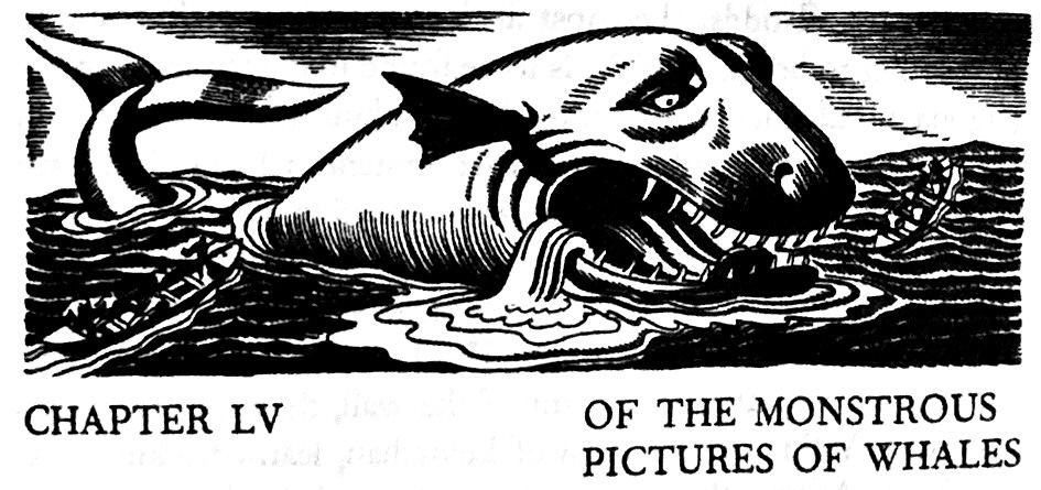
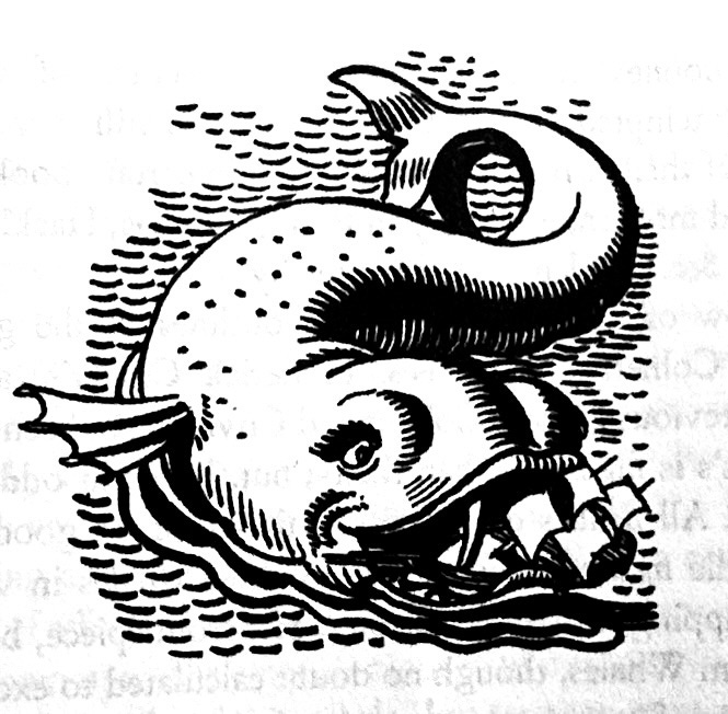
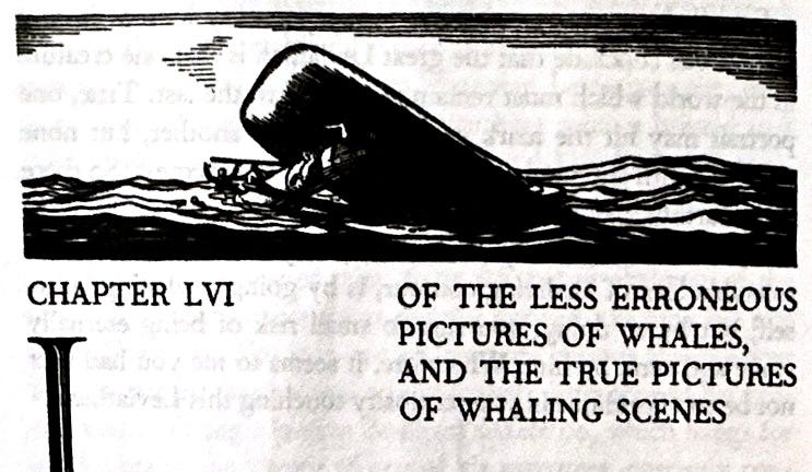
And Kent even falls into cartoonishness. Following his love of art, Melville spends several chapters in the middle of the novel lecturing on the flawed and inaccurate artistic depictions of whales. Here is where Kent reverts to comic caricature, mimicking the anthropomorphic animal style of 1920s comic strips and children’s books. In one image a rubbery, impossibly twisted whale seems to have adorable eyelashes. And yet in the next chapter on more accurate artistic interpretations of the big fish, Kent snaps back into illustration mode. Again, Kent is not illustrating so much as interpreting the text. In rediscovering Moby Dick in the 20s, scholars underscored Melville’s Ahab-like solemnity and high ambitions for this novel about God and man, democracy, fate and free will, not to mention art itself. Subsequent scholars have understood Melville’s deep connections to American humor and popular art of the day. At many points in the novel he is channeling the satire magazines of his day and even invoking the outrageousness of P.T. Barnum. Kent seemed to understand this, at least in part, before the scholars caught up. In fact, I am hard presse dot think of a book illustrator being so deeply in tune with an author than Kent’s version of Moby Dick.
So, why invoke a beloved illustrator like Rockwell Kent here at a comic strip history site? To begin with, studying the cultural history of American comic strips cannot be constrained by genre silos. Newspaper strips lived within a wider visual context of formal painting, book and magazine illustration, let alone film and advertising. Understanding the linkages among these genres, and their shared impulses can better uncover how they functioned as cultural expression.
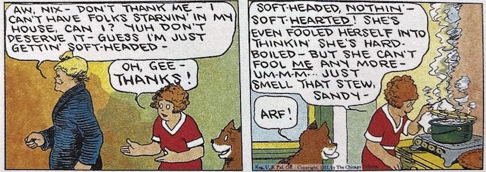
For instance, I don’t think it is too much of a stretch to see echoes of Kent and the wave of woodcut artists with the greatest folk stylists of the 20s and 30s comic strips, Harold Gray, Frank King and Chester Gould. They all followed artistic principles of simplification, using thick linework, basic shapes and stark contrasts to represent people and objects in iconic forms. Their simple, elemental style embodied a search for moral clarity. Kent was a spiritual seeker. And his was an art style that seemed closer to cave painting, stained glass, pre-lithography printmaking and folk art. Indeed there is a folksy realism to Kent’s style, a paring down of detail and rejection of adornment or naturalism. The woodcut artists like Lynd Ward (God’s Man, 1929), James Reid (Life of Christ in Woodcuts, 1930) dramatized stark and broad spiritual and class conflicts. And as we have argued in several posts about Gray. King and Gould, they all invoked a plainspoken American visual style to serve a simple, pre-modern moral worldview at odds with their times.
There is also a strong sense of craft that Kent’s style shared with both woodcut art and cartooning. Evidence of the idiosyncratic human hand is critical to all of these media. An artist struggling to be expressive, using blunt etching instruments and unforgiving media is an implicit drama of every woodcut. You could argue something similar is at work in comics. As much as the comic strip of the 20th Century represented the industrialization of the cartoon arts and a domestication of some of its earliest anarchic and vulgar qualities, it remained one of the least collaborative of all mass media. The visual signature of every artist on the comics page was unmistakeable and highly individual. Even in this mass produced medium, whose syndicates ensured artists kept it family friendly, uncontroversial and inoffensive, idiosyncrasy peeped through the homogenizing tendencies of modern mass media and industrialization. There is a fundamental individualism to the modern comic strip that presses against the modern world it is dramatizing on multiple levels. A single artist is using the most basic pre-modern art tools to draw idiosyncratic worlds in rough abstract styles that look nothing like the rest of the newspaper experience. This is an art that uses some of the most basic low-tech tools (pen and ink) in a newspaper defined by high speed presses, photography, homogenized reportorial voices. And of course the overwhelming majority of the major comic strips of the last century were named after individuals – Little Nemo, Little Orphan Annie, Dick Tracy, Flash Gordon, Mary Worth, etc. etc. This is not remotely true of modern literature or film and only partially true of radio and TV. Most comic strips are hero’s journeys – a never-ending story of self in the modern world. The sub-text of the comic strip, both in content and form, may be the survival of personal identity, perspectives and power in a mass society.
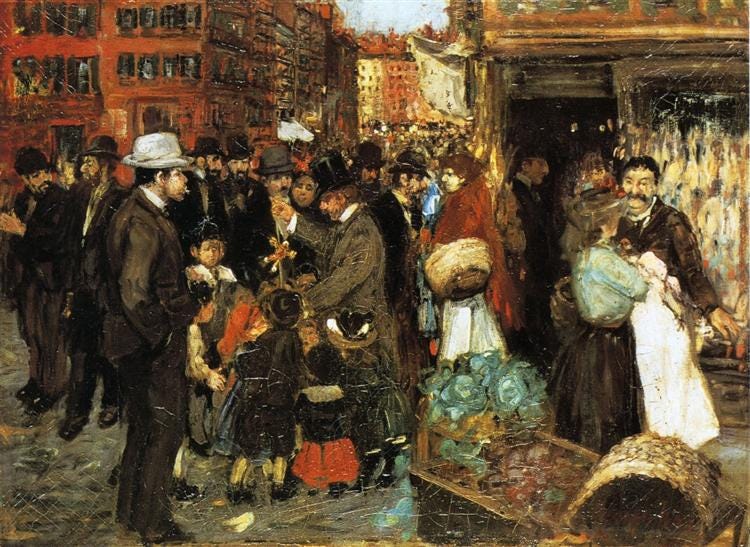
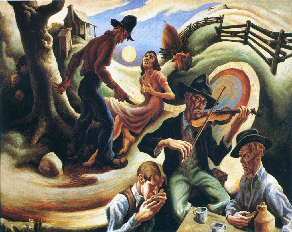
These illustrators and cartoonists shared more than a passing resemblance to some of the 20th Century American Realist painters. The Ashcan School and “The Eight” of the early 1900s were comprised almost entirely of newspaper illustrators like John Sloan and George Luks. Their focus on everyday working class and urban subjects was part of a self-conscious attempt to craft an American realist response to the European avant-gardism. In the 1920s, Edward Hopper and Thomas Hart Benton helped move us toward an explosively nationalist American Regionalism (Benton, Grant Wood) that celebrated commonplace, local rituals and folk – the stuff of the newspaper comic. Like Kent’s, their styles were cartoon-adjacent: thick outlines, swathes of bright color, emblematic figures with rounded, flowing lines.
These connections across illustrators like Kent, woodcuts, “American Scene” painters and cartoonists are important to a more mature and I think richer understanding of comics’ cultural role as a popular art. Comics historians tend to fetishize the “modernist” qualities of comic arts, how they played with ideas of time, motion, and consciousness in ways that anticipated the Cubists like Du Champ and Picasso. In this telling, Winsor McCay, Lionel Feininger and George Herriman are a kind of prehistoric avant-garde of High Modernism. Personally, I accept many of these arguments as I read them in recent very good works like the Comics and Modernism: History, Form, and Culture. At the same time, however, I find this approach too narrow. It misses the broader and more obvious connection of early 20th Century comic strips to American Realism. The course that American painting was taking after 1900 towards depicting the everyday rituals and objects of modern life in a representational, albeit stylized, way, parallels American cartooning. The comic arts and what some art historians call “American Scene” painting not only share many stylistic turns but even a lot of the same personnel.
I think looking at the cartoon linkages among a master illustrator like Kent, or a sentimental realist like Norman Rockwell, the abstract realism of Regionalist painters, etc. is ultimately a richer way to understand American comics than reiterating how much Pablo Picasso adored The Katzenjammer Kids.